DoDone, Personalized Organization App
I worked on this project with a team of 4 friends. While my role was primarily in product design, I also played a significant role in organizing meetings, collaborating on ideas, researching and developing the low and high-fidelity screens, final design and edits for our app. We followed the process illustrated below:

We have taken the time to study and understand all the possible problems that the average person faces when trying to make a plan for their day / week / month. It was important for us to understand how much information needs to be taken into account, how many things / events need to be thought about. The team also needed to understand how people spend time on tasks and how productive they are.
Research:
Our team conduct some quantitative research in an attempt to identify patterns in problem solving among users.
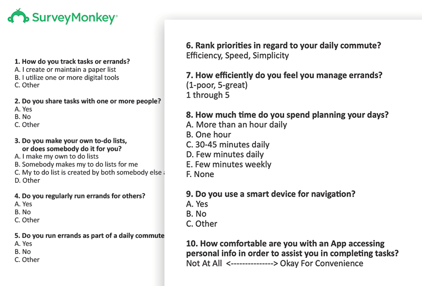
In this step, we dove into using our empathy insight skills by conducting a 10-question survey via Survey Monkey. We were interested in learning what a person’s typical day looked like. What frustrations they had when completing their tasks, and what methods they used to remember tasks. Our survey group was aged between 19-69 years old, with a survey pool of 37 people
Results:
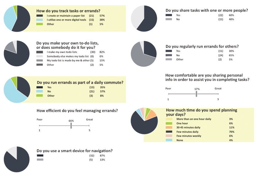
Survey results showed: that 57% of the participants create or maintain a paper list, and only 38% use a digital tool. The quantitative data suggest that there is a large pool of people that don’t use a phone to keep track of their errands. The most interesting part was that most people spent little time planning their errands and do not always feel like they were efficient at doing them.
Based on the results above, we learned that users did not complete errands on their way to work. The data showcased that users need an efficient and easy way to keep track of their tasks. We realized that our audience is very wide, and it will be useful for us to more openly discuss pain points and wishes of our users.
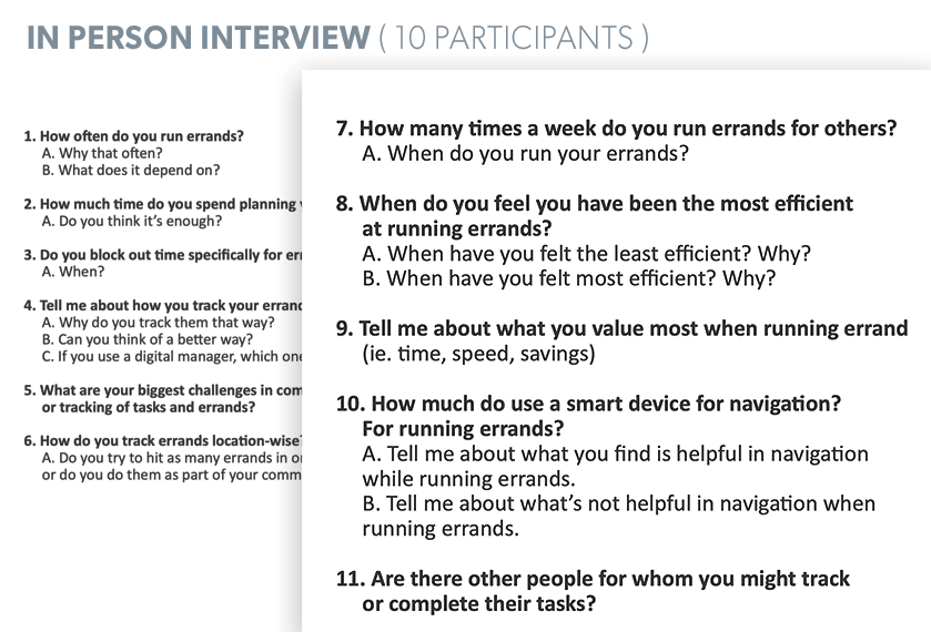
With this in mind, we continued with our research with personal interviews and gained a few important insights: “something I don’t find helpful about navigation when running errands, is that it doesn’t tell me that I am done with the” and “if t’s not on a list, I don’t think about it, but my wife can’t get a list in front of me before I leave work”. Another one: “I value money the most when running errands. Gas is MONEY, time is MONEY, price is MONEY”. Here are the criteria we looked at when conducting the interviews:

“Busy working people need a way to remember and accomplish tasks in the fewest steps possible in order to save time and money.”

Based on the interview answers, we’re able to put together a compelling problem statement. Keeping this problem statement in mind, we studied current tools in the existing market and identified 7 popular applications. We then decided to do a deep dive into these seven applications to understand how the applications addressed user needs, how they managed tasks, and how the general navigation worked.
What we learned: The most popular apps covered basics like Calendar, Task Details, and Organization. However, Errand Navigation, Task Collaboration, and Gamification were not common features.
What We Discovered: Applications excel either as either excel as task trackers or errand navigators. The ability to manage time and accomplish tasks is completely affected by location.
We created “How Might We” and “Point of View Statements” using insights from our research and stories. A key insight that we found overlapped multiple interviews was that people typically ran their errands between one and five times a week. Thats alot of times to be running errands. Most people dont have time to plan out their errands and they worry about them on the go. That can be stressful. Participants try to remember errands and locations via memory or pen and paper.
The collected data helped us to form user personas that I referred to throughout my product design process. Based on the data received, we have compiled a list of key features that should be included in our product. They also helped us understand how we can improve the features already available in the market. Here are some of the key features we’ve learned:
Mapping a List of Tasks:
Multitasking moms need real-time navigation for errands to help them get their kids to their activities.
Task Sharing / Assign:
Commuting dad needs a way for spouses to post real-time errands he can complete, as part of his long drive, in order to aide household chores.
Task Achievements:
Competitive young professionals would greatly appreciate a way to track and promote their superior progress in task completion.
Time/Money Efficiency:
Budget-conscious parents need to be efficient with gas and time in order to stretch their monthly income.
List of possible solutions based on user needs:
– Manage time on tasks, then validate time spent.
– Generate a report showing where we spend our time on tasks.
– Make it easy for users to manage to-do lists, track time and set constraints in one place.
– Add the ability to prioritize tasks.
– Add the ability to easily add tasks and to search to-do lists.
Product Features & Benefits:
– Calendar
– Category of Tasks
– Daily Task Checklist
– In Route Task Preview
– Assign & Share Feature
– Achievement Tracking
Main idea of the product is DOing tasks and getting them DONE. This is how the name of the product DoDone was born.
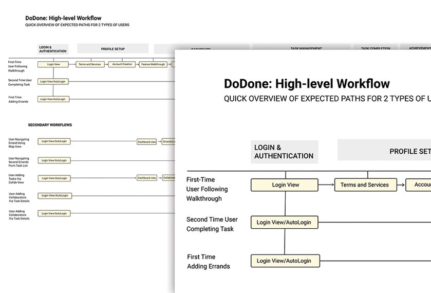
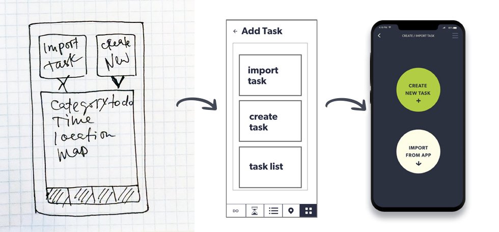
From sketch to low fi and high fi prototypes. I separated users into 3 groups: New users / Current users / User managing shared tasks. Flows directed me to where the main steps needed to be. As an example, users need to be able to create a new task as well as import tasks from their other apps. This meant I needed to add a “permissions” step in order for them to access other data on their device.


Based on the work flow wireframes I started to work on rough sketches and discover of what could visuals should be, what impression and concept it can be.
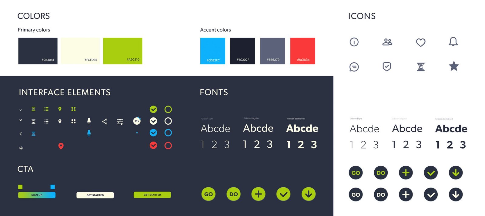
Main product elements:
– Bottom menu with CTA (call to action).
– CTA on every main page
– Top Navigation with additional links
– Option for Back to previous page
– Permission boxes
For the design system, It was important for me to create a clean, modern, simple, focused and practical style. It was also important to offer an option for user to have customized themes based on their mood or day/night time.
Design evolution and progress:
I applied look and feel and created new graphic language that would help us refine our ideas further. We wanted the list of necessary places to be shown immediately on the map and the application would correct the suggested movement using the available data; for example road traffic at this time, priorities, working hours of the store, etc.

Our main screens ended up being “Create a New Task” and “Import From App” (import data from another application). I utilized minimalistic, simple screens with large elements to help with the intuitive flow of the application.
We ran our first tests on printed wireframes. The initial responses we received gave us the idea to turn on the voice activation feature. Since many people talk during the trip, and it is very difficult to make a plan, add a task to the list of the day, or find free time in the schedule. Here is what some of the feedback looked like:
“Commuters on the road need to modify their route on the map so they can quickly adjust their workflow to the traffic.”
“Busy commuters need a way to vocally adjust scheduled errands or appointments in order to safely manage their time while driving”

Another cool feature that we decided to add was splash images that would appear on screens to invite / remind / help the user complete another task. For example, if the calendar says “Mom’s birthday in 2 weeks” – there would be a preview of the splash screen with a photo of mom and a link to shop for her birthday.

While discussing the splash pages, we concluded that there was a way to monetize this portion of the application. This led us to add another user group. Here is the user story we came up with:
“As a local shop owner, I need to advertise to people near my location so that I can attract real people in my area.”

Test
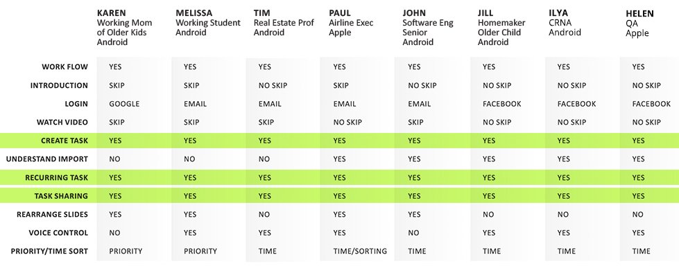
In the first round of testing We had eight participants of various ages and occupations. Based on our data, we created a table that helped us discover that most of the older participants skipped the video tutorial, however the younger demographic wanted to see the video tutorial. All people successfully went through the creation of tasks. We were also able to observe that few people didnt understand the usage of the word “import.”
After we received everyone’s feedback, I made all the improvements and necessary updates and we tested our prototype again.
In the second round of testing, all the edits we made seem to have removed most of the users’ concerns and influenced positive results. From an accessibility point of view, I thought it would be useful to be able to customize it and created a “light color” version of DoDone.
