CASE STUDY
Revamping FXCM's
Main Site Navigation
About FXCM
FXCM is a large organization that delivers multiple products and services in the online trading industry. The website navigation system plays a crucial role in how efficiently users are able to locate information and accomplish tasks on the website. As FXCM expanded, it became evident that the existing navigation system needed an overhaul to better serve users, especially new ones who are critical to the company’s growth.
Define
Clarify the problem, objectives, and user needs to set a strong foundation for the project.
Research
Gather insights into user behavior and industry trends to inform the design process.
Analysis & Planning
Synthesize research data, create personas, and plan the project’s scope and goals.
Design & Development
Translate insights into wireframes, collaborating with developers to bring designs to life.
Testing
Validate designs through testing, refining based on feedback to meet user needs.
During our weekly collaboration workshops with the Analytics, Management, and Creative teams, we carefully identified the key pain points within the existing navigation system. Usability testing revealed that changes in the navigation affected different user groups in varying ways. Our primary focus became optimizing the experience for new users, with the ultimate goal of converting them into account holders.
Research:
We started with Analytics Research to dive deep into the existing data. By analyzing user behavior and site metrics, we identified areas where the navigation was falling short. This data-driven approach was crucial in understanding the scale of the problem.
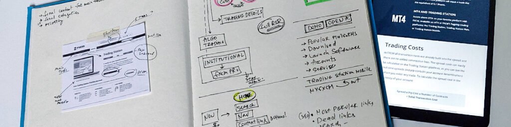
Next, in the UX Research phase, I led a series of brainstorming sessions with colleagues from various departments, including customer support teams, project managers, and analytics experts. These sessions provided valuable insights into the users’ pain points. For me, it was an eye-opening experience to step back and view the navigation, which I was deeply familiar with, from a fresh perspective. Through this research, we discovered specific issues such as poor information hierarchy, inconsistencies between mobile and desktop versions, an outdated design, too many main tabs, and an unintuitive user flow.<be>
Below is a preview of the FXCM site’s previous look and navigation structure.

We developed a document outlining UX strategy improvements and recommendations, focusing on our primary goal:
Produce a system that can logically represent a wide breadth of content, including different products, features of the main platform, educational pieces, various articles, etc.
By mapping the site and categorizing content, we identified and framed problem areas. We considered business requirements, constraints, and internal and external factors. Internally, we focused on the company’s needs and goals, while externally, we evaluated the market context, competitors, and industry best practices. Our aim was to translate business value into a seamless digital experience.
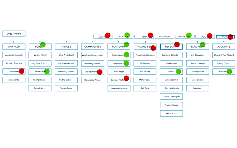
Some specific problems with FXCM navigation were:
– Bad information hierarchy in the navigation
– Mobile and Desktop preview inconsistencies
– Old look and outdated structure and design
– Too many main tabs
– Unintuitive flow
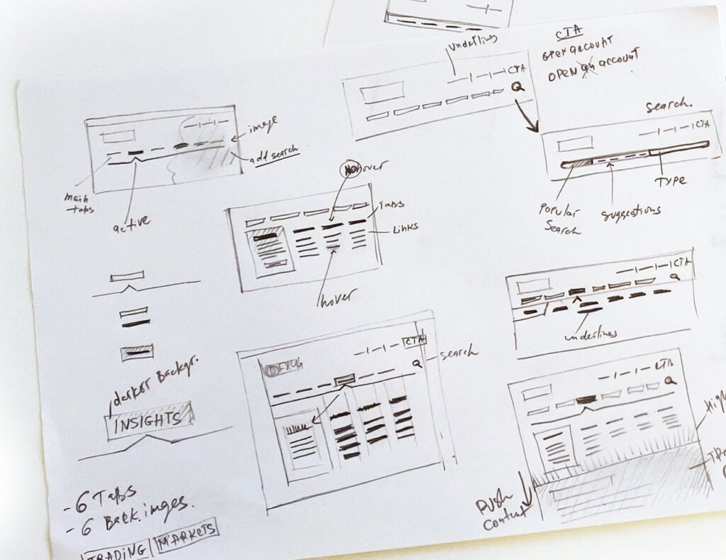
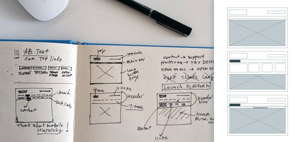
During our subsequent collaboration workshops, we streamlined user flows by removing, merging, and adding pages as needed. We developed a content-based navigation system with a more logical and intuitive flow and presented an overview of the new website structure.
Given that the navigation redesign encompassed all header components, we conducted A/B tests on the top navigation, reviewed label names, and carefully evaluated colors and placement. This process allowed us to determine the most effective solution.
What we achieved and learned:
User-Centric and Task-Centric Navigation: The navigation must be intuitive, helping users complete tasks with minimal instructions.
Increased Efficiency: Providing quick access to information and allowing users to complete tasks as swiftly as possible is crucial for website success.
Enhanced User Awareness: Users should always be aware of their current context and task status. They should be able to answer: What am I doing? Where am I? What’s next? Additionally, users should be notified of any task status changes.
The website’s navigation structure is now organized based on a hierarchy of importance.
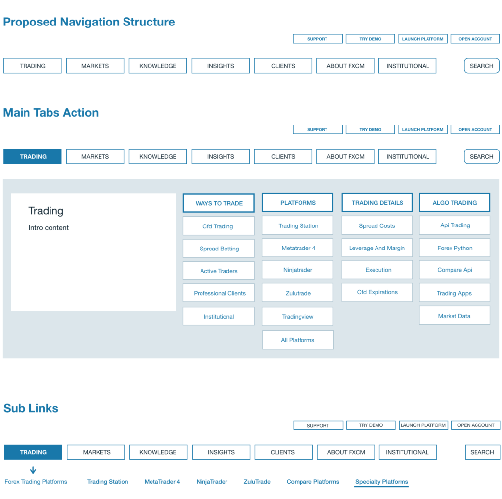
Once the planning and foundation were established, I proceeded to create wireframes for both mobile and desktop experiences.
Before diving into the design process, I reviewed my ‘must-have’ list:
- Consistent and logical navigation
- Effective user wayfinding
- Accessible and clear labeling
- Guidance on what to do next
- Design focused on user needs
- Updated visuals and enhanced content discoverability
Design
It was crucial for me to develop a modern and engaging visual style that reflected the brand’s personality while preserving the clean look of the existing website.
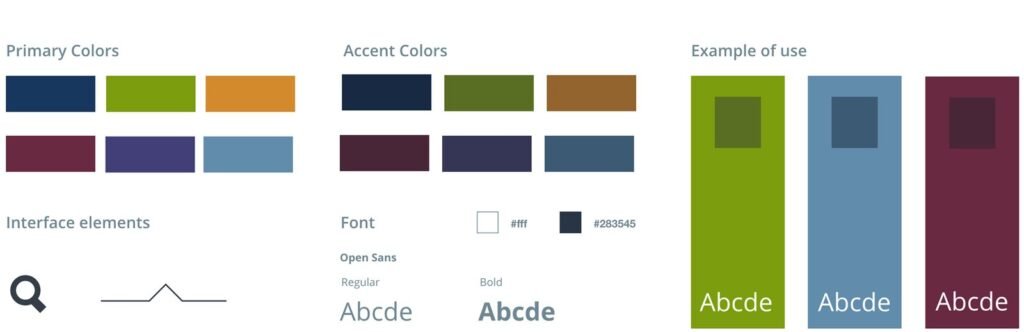
I designed colors, fonts, and layouts to be clear and prominent. The background featured deep colors and thematic imagery, with a darker gradient used to highlight relevant links (hover effect). Additionally, I ensured that there were ample margins between navigation elements to enhance focus and usability.
DESIGN SYSTEM
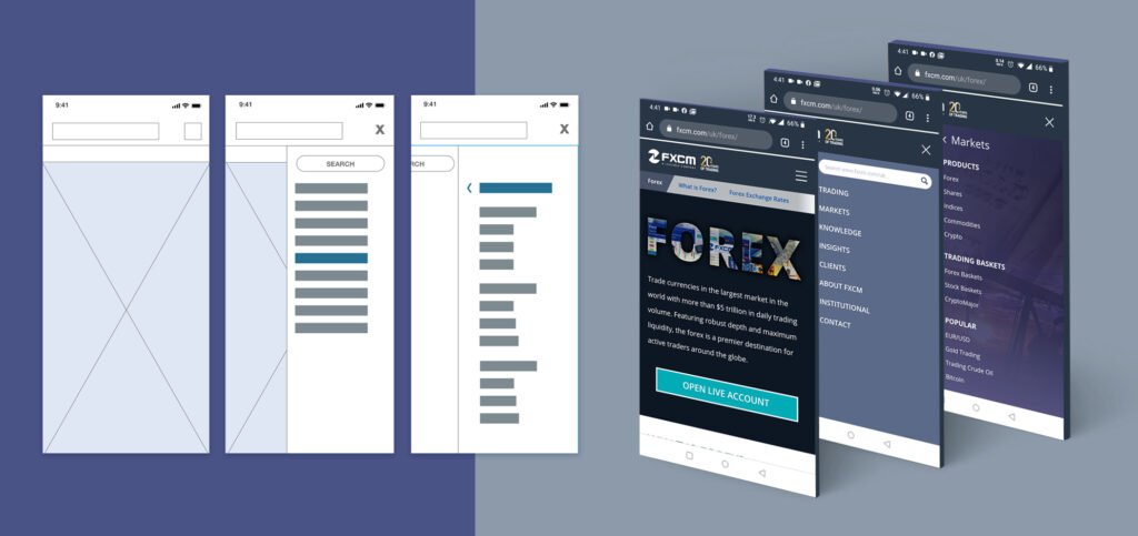
Applying the new FXCM header/navigation with a mobile-first approach was essential, as Google primarily uses mobile versions for indexing and ranking. Ensuring the site loads quickly and is mobile-friendly supports better search engine rankings
Development
The next step involved preparing all necessary files, recommendations, and materials for the development team and collaborating with them on the implementation.
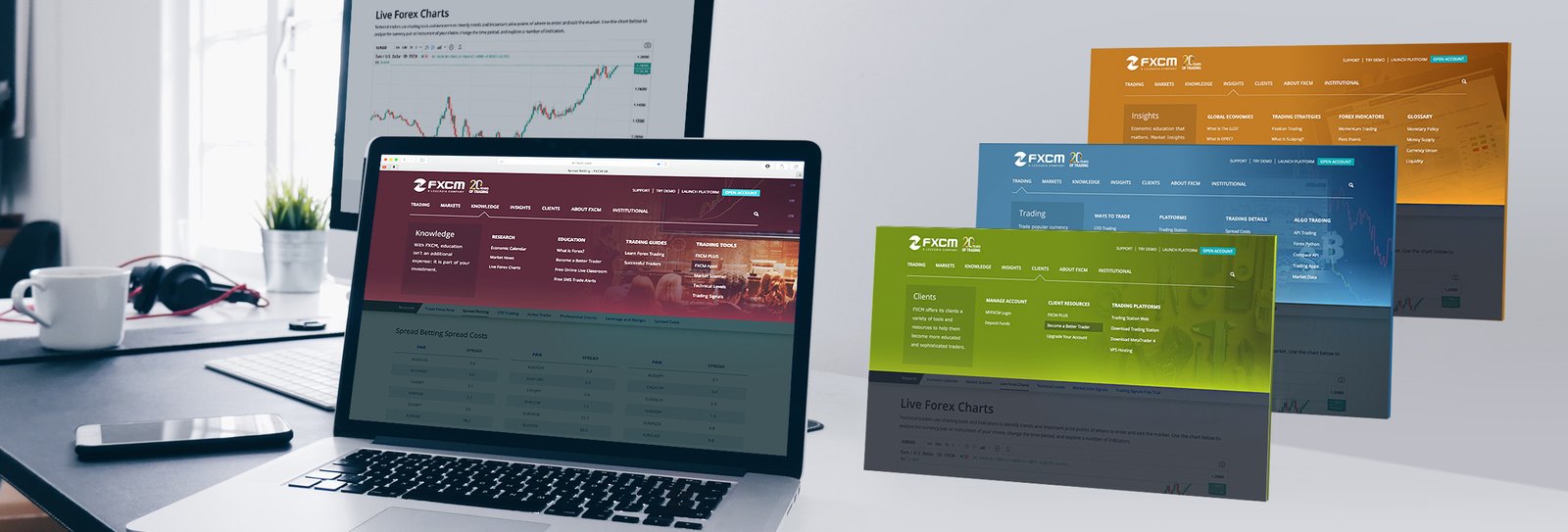
We conducted a round of testing by applying the new header/navigation to the FXCM UK website. Following successful usability test results, we proceeded to update all FXCM sites with the new navigation structure.
Launch / Testing / Updates / Testing:
With the new navigation structure successfully implemented across FXCM’s websites, we entered the final phase of the project: ongoing testing and updates. We closely monitored user interactions and collected feedback to ensure the navigation system performed as intended. Regular updates were made to address any emerging issues and refine the user experience. This iterative approach allowed us to continuously improve the navigation, ensuring it remained effective and aligned with user needs and business objectives.
HAVE A PROJECT IN MIND? Contact Me Today