Navigation Revamp
Main Project Phases:
– Analytics Research
– UX Research
– Visual Design
– Development
During the weekly collaboration workshops between the Analytics Team, the Management Team, and my Creative Team, we defined the pain points of the existing navigation. The usability test results showed the change in the navigation system has different levels of impact on different groups of users. The main target was the new users, who, in a best-case scenario, would need to be converted into new accounts. After iterating on a few ideas, I was able to produce wireframes and UI elements that were then implemented with the help of a few key developers.

Research:
We collected data by scheduling brainstorm sessions with small groups of colleagues who worked closely with the end-users, customer support teams representatives, project managers, and analytics teams.
For me, it was an interesting experience to step back and look at the navigation that I was deeply familiar with through a new lens. I was eager to dive into the research and define the right problem to solve. Below is the preview of the old look and navigation structure of the FXCM site.

We created a document with the UX strategy improvements and recommendations, where we outlined our main goal:
Produce a system that can logically represent a wide breadth of content, including different products, features of the main platform, educational pieces, various articles, etc.
By creating a site map and segregating the content, we understood and framed the problem areas. It was important to include business requirements, constraints, and politics. We approached our business requirements from an internal and external perspective. Internally, we were concerned with the business’ needs and goals. Externally, our attention was on the context, the competitors, and the industry best practices. We needed to translate business value into the digital experience.

Some specific problems with FXCM navigation were:
– Bad information hierarchy in the navigation
– Mobile and Desktop preview inconsistencies
– Old look and outdated structure and design
– Too many main tabs
– Unintuitive flow
During our next collaboration workshops, we simplified the user-flows between pages by removing, merging, and adding pages where needed. We created the content-based navigation with a more logical and intuitive flow and presented the big picture of the website structure.
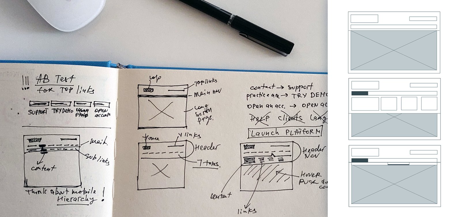
Since navigation redesign included all header components, we ran A/B tests for the main top navigation, reviewed the naming of the labels, and took a close look at the colors and location. This exercise helped us understand what would work best in the end.

What we achieved and learned:
User-centric and task-centric navigation. The navigation must be intuitive enough to aid the users in finishing their tasks with minimum instructions.
The importance of increased efficiency. Proving quick access to information and allowing users to be able to complete tasks as quickly as possible is integral to the success of a website.
Increased user awareness. The user should be aware of the environment and the state of the tasks they are doing. Users should always be able to answer the following questions: What are you doing? Where are you? What are you doing next? Also, users should be notified when a task status changes.
The website’s navigation structure is now rearranged based on a hierarchy of importance.

Once all of the planning and foundation was built, I was ready to work with wireframes for the core mobile and desktop experience.
But before I started the design process I went over my “must-have” list:
– consistent and logical navigation
– aiding in the user’s wayfinding
– accessible and clear labeling
– helping the user decide what to do next
– design with the users’ needs in mind
– updated artwork and improved content discoverability
Design
For me, it was important to come up with a modern and appealing visual style that would shine a light on the brand’s personality. At the same time, I knew it was integral to maintain the clean look and feel of the existing website.
Colors, fonts, layouts were designed to be clear and prominent. The background was set to deep colors with theme imagery and I used a darker gradient for highlighting relevant links (hover effect). I also made a point to keep large enough margins between the elements of the navigation box which made them easy to focus on.
Design system

It was important to apply the new FXCM header/navigation new structure on mobile-first since Google predominantly uses the mobile version of the content for indexing and ranking. Quick-loading, mobile-friendly sites enjoy a healthy ranking within the search engine.

Development
Our last step was to prepare all needed files, recommendations, and materials for the development team, and to work with them on the final implementation.
We also performed a round of testing, where we applied the new header/ navigation to one of the main FXCM websites (UK). After receiving successful usability test results, all FXCM sites were updated with the new navigation structure.
