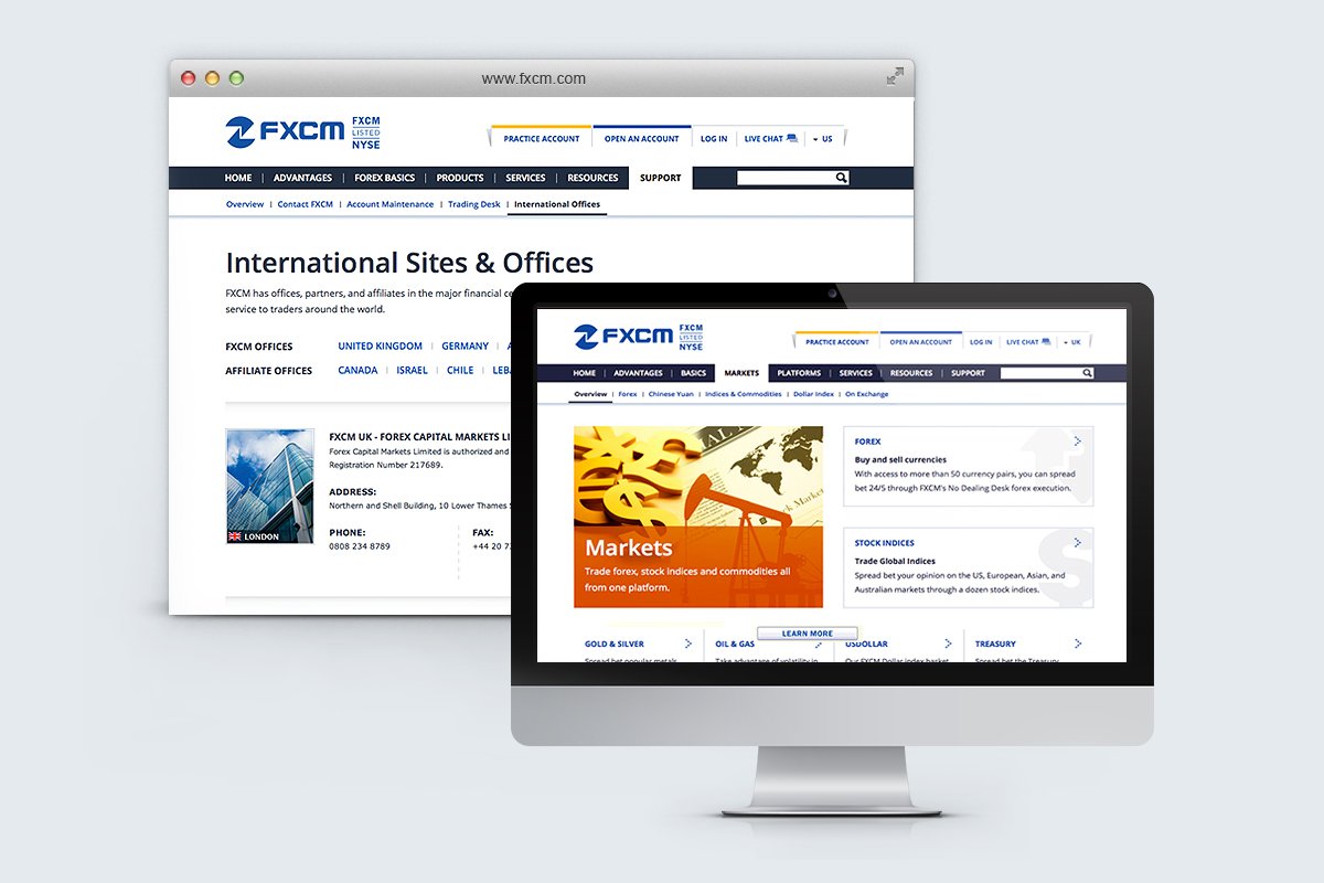
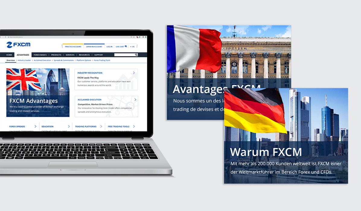
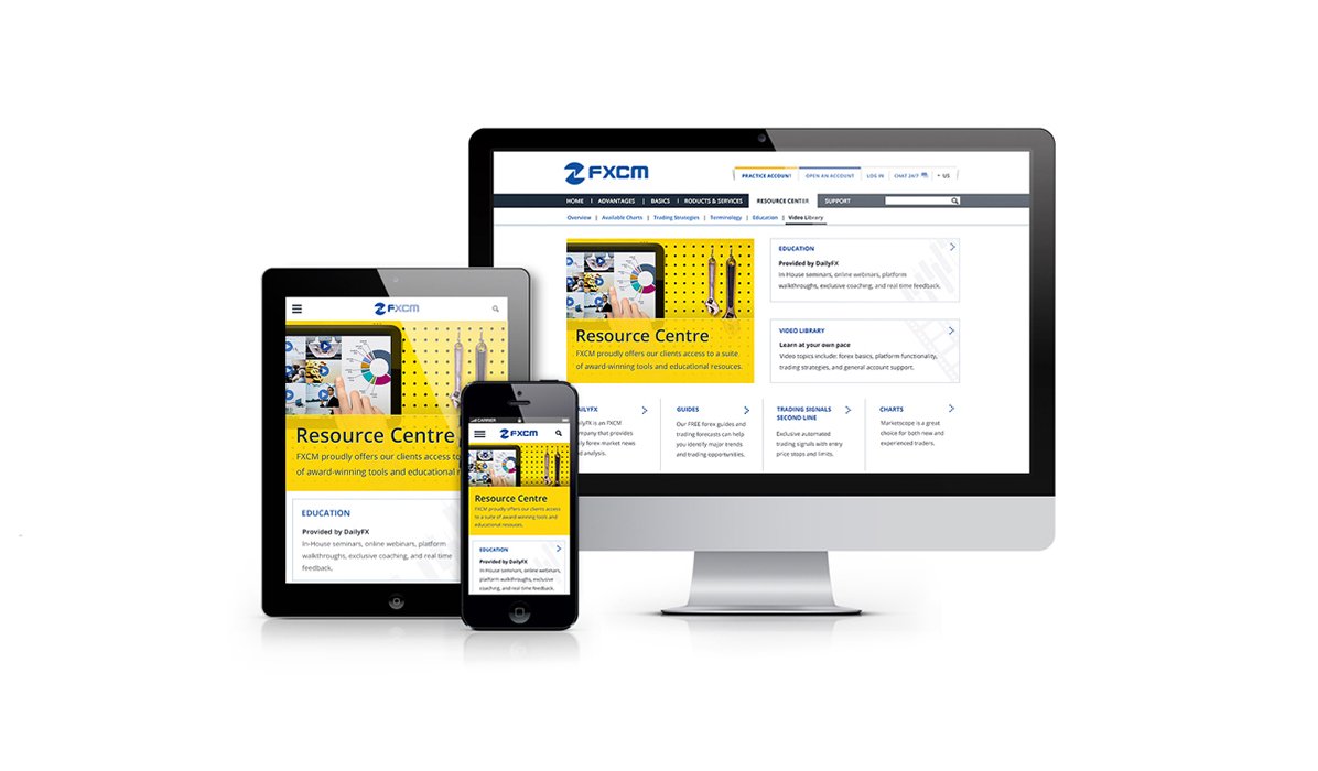
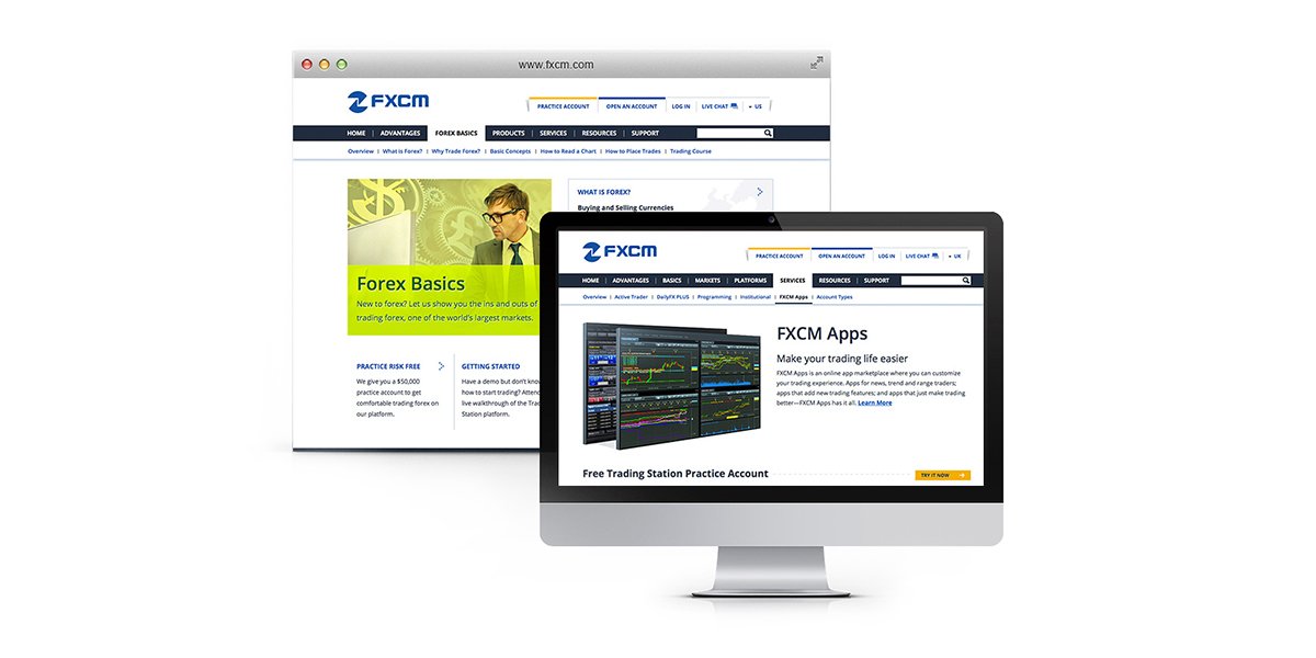
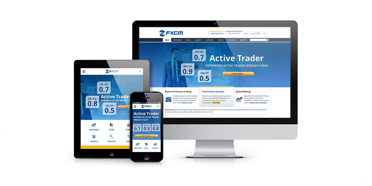


Developing the product pages for FXCM was a fascinating project involving extensive research and thoughtful design. As the company expanded, there was an increasing need to promote a growing number of products, while maintaining a consistent look and feel across the site. The challenge was to create pages that were not only visually appealing and engaging but also effectively incorporated multiple Call to Action (CTA) elements, which needed to be subtly integrated as secondary features to avoid overwhelming the user.
The approach focused on using large, bright imagery to draw attention and enhance the user experience, combining it with essential content and strategically placed CTAs. Each product section was designed to provide a cohesive presentation of the offerings, with main pages dedicated to each product and intuitive navigation allowing users to explore different products without losing the opportunity to sign up for a trial. This careful balance ensured that the product pages remained attractive and user-friendly, while still driving conversions and promoting FXCM’s diverse range of services.


